
Willhelms bold approach to printing, coupled with his kaleidoscopic use of colour conjours images of futuristic neo-tribes...the OTT nature of his pieces shouldn't work all thrown together, but somehow, it always does.
For his AW11/12 collection, Willhelm has gone to an extreme with the use of colour, a brave progression from the muted pastels used in his SS11 collection...I love that he chose bright colours for winter, and muted shades for summer, its something you don't often see!
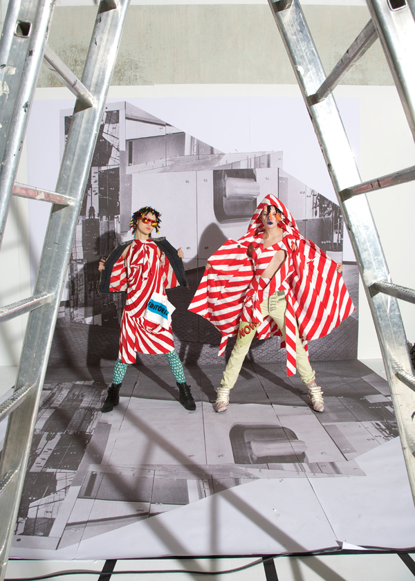
His latest collection will certainly get you noticed during the cold winter months, especially if you emulate the models in his ad campaign. Layering digital print dresses with clashing techno printed socks, along with huge knitted jumpers that look like they where made by your 90 year old blind grandmother (they look awkward, but still amazing!)
The style of the collection overall is very reminiscent of past Vivienne Westwood Gold and Red label collections, and its not surprising to learn that this is probably due to his internship with her. Despite his obvious inspiration, the collection is still typically Willhelm: Against the grain, forward thinking and very tongue in cheek.
Here are a few of my favourite looks from the AW11/12 collection...and I've got to say, I LOVE these shots! They're bursting with energy, and the whole thing looks like It was a blast to shoot...Another nice change to see: sullen models looking dressed wearing such amazing clothes gets very old very fast!


No comments:
Post a Comment